Introduction
Time Series Decomposition is a method for separating the overall time series data into multiple components that, when recombined, constitue the original time series. The value of this is that identifying each component often enables us to think about the factors that influence that sub-component directly and, thus, better understand the data and what causes the overall pattern we see. Also, decomposing time series data permits us to forecast how the overall time series will behave into the future based on our understanding of the separate components and what is driving them.
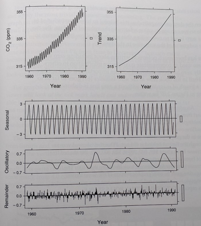
The image below is from the William S. Cleveland book The Elements of Graphing Data, and it is an excellent example of time series decompostion. It identifies and overall trend, a seasonal pattern, and some oscillation that is somewhat regular. There is always some part of the pattern that doesn't follow a regular pattern and we call that the Remainder or, sometimes, Noise.
Example 1: Demand Pattern Decomposition
Experience would suggest that this first example is obviously fictious data because its patterns are significantly more consistent across time than real-world data. Nonetheless, it is a good first exercise, particularly, because the obvious patterns make this first exercise easier than is normally the case.
This data was adapted from the textbook Supply Chain Management: 3rd Edition, by Sunil Chopra and Peter Meindl, Prentice Hall, 2006.
We will be using matplotlib, numpy, and pandas, so let's import those packages now, as well as execute the matplotlib magic command.
import pandas as pd
import matplotlib.pyplot as plt
import numpy as np
%matplotlib inline
Read the data.
df = pd.read_csv('TSDataP1.csv')
df.head()
Let's look at the data, first, to begin to understand it.
plt.plot(df.Quarter,df.Product1Demand)

Describe the pattern in this graph? What "component patterns" do you see within the overall graph?
At this point you should observe an overall (positive) trend and seasonality. To perceive the trend, ask what results a linear regression analysis would yield for intercept and slope. Perhaps, you will intuit that the trend in this graph is a linear one rather than a nonlinear one.
You could, and should ask yourself what is causing those patterns. You may know the causes from experience if you are familiar with the context or, alternately, you may need to do research to determine the causes. If you were a consultant, you might well be in the latter position.
Our goal now is to decompose these data. Doing so will enable us to forecast demand into the future because the components are easier to detect and express individually, so that we may extrapolate them into the future. We need to assume a functional form for how the components contribute to the overall pattern in order to guide the math that we do. For our purposes, we will assume this model, which is called an additive model:
- $D$ = Product Demand
- $q$ = the index of the quarter
- $L$ = The 'level' component of the demand pattern which is a constant value
- $T$ = The (linear) trend of the data. This is the amount that demand increases, on average, from one quarter to the next. T is also a constant.
- $S \left(q \right)$ = Seasonality component. We need to figure out how many quarters there are before the seaonal pattern repeats so that we can determine the seasonality component for each quarter, $q$.
- $\epsilon \left( q \right)$ is the portion of demand that we will not be able to fit with $L$, $T \left(q \right)$ and $S \left(q \right)$.
$D\left(q \right) = L + T \left(q \right) + S \left(q \right) + \epsilon \left( q \right)$
We can easily get $L$ and $T$ from a linear regression analysis. We will use a new Python package for this analysis. Many Python packages can do this analysis well.
from scipy import stats

slope, intercept, r_value, p_value, std_err = stats.linregress(df.index,df['Product1Demand'])
print('intercept =', intercept, '    slope =', slope, '     p_value = ',p_value)
Now we need to 'remove' the trend and the level from the original demand pattern to see what pattern remains for use to describe seasonality. We use the DataFrame.apply() method from pandas to compute the value for each quarter from the regression model, which we will put in a column called regress. then we will subtract that part of the "signal" from the original sales trajectory and put the remainder in a column called R1 for 1st remainder.
Notice the last block of code, which formats the columns of the DataFrame if you haven't seen this technique previously.
def create_regress_col(row, intercept, slope):
    return float(intercept) + float(row['Quarter']) * slope

df['regress'] = df.apply(create_regress_col,args = (intercept,slope),axis = "columns")
df['R1'] = df['Product1Demand'] - df['regress']
df.style.format({
    'Product1Demand': '{:,.0f}'.format,
    'regress': '{:,.0f}'.format,
    'R1': '{:,.0f}'.format
})
Here is a plot of the R1 data column.
plt.plot(df.index,df.R1)

This looks like a repeated pattern.
How many quarters pass before the pattern repeats?
When the autocorrelation value for a particular lag is large and positive (close to 1), it indicates a cyclic pattern with the periodicity of that lag.
# Create column with lag of 4
lag = 4
df['lag4'] = np.NaN
for i in range(len(df['lag4']))[lag:]:
    df['lag4'].iloc[i] = df['Product1Demand'].iloc[i-4]
print(df.head(n=10))

# Compute autocorrelations
for i in range(int(len(df.index)/2)):
    print('autocorrelation, lag =',i,':',df.R1.autocorr(lag = i))

fig,ax = plt.subplots()
ax.plot(df.Quarter,df.Product1Demand,c='k')
ax.plot(df.Quarter,df.lag4,c='b')
ax.set_xlim([1,19])
ax.text(16.3,210000,'Demand',color='k')
ax.text(16.3,195000,'Lagged\nDemand',color='b')
ax.set_xlabel('Quarter')

This code plots each sequential series of 4 points, where 4 corresponds with the periodicty of the data. Note how the patterns have similar shapes, which is why the autocorrelation with this lag was nearly 1. Let's create a graph that demonstrates this by plotting each successive group of four points.
dfQtr = pd.DataFrame()
cycleLen = 4
for i in range(int(len(df.index)/cycleLen)):
    newData = pd.DataFrame({i:df['R1'].iloc[i*cycleLen:(i+1)*cycleLen]})
    newData.index = range(0,len(newData))
    dfQtr = pd.concat([dfQtr,newData],axis=1)

fig,ax = plt.subplots()
ax.plot(dfQtr)

If we average the demand for each of the seasonal quarters, so those averages represent all the curves well?
avg = []
for i in range(len(dfQtr.index)):
    avg.append(dfQtr.iloc[i].mean())

dfQtr = pd.concat([dfQtr,pd.DataFrame({'avg':avg})], axis=1)
print(dfQtr)

fig,ax = plt.subplots()
c = 180
for col in dfQtr.columns.values:
    if col == 'avg':
        ax.plot(dfQtr[col], c = 'r')
    else:
        ax.plot(dfQtr[col], c = 'k')

What does the remainder of the demand pattern look like if we use the average seasonality?
The code below assigns a seasonal component of sales to each quarter based on the average that was computed above and puts it in a column named S.
Next, The 2nd remainder is computed, R2, which is the difference between the original sales trajectory and the sum of the regression model and the seasonal component, $L + T \left(q \right) + S \left(q \right)$. That is, if you look at the oriignal mathematical model, the values in R2 are equal to the term $ \epsilon \left( q \right)$ in the model.
A column named Composite is computed, whcih is the sum of the regression model and seasonal effects, and the percentage error is computed in the columne errorPerc.
df['S'] = np.NaN
df['R2'] = np.NaN
df['Composite'] = np.NaN
df['errorPerc'] = np.NaN
S = dfQtr['avg'].tolist()
for i in df.index:
    df.loc[i,'S'] = S[i%cycleLen]
    df.loc[i,'R2'] = df.loc[i,'R1'] - df.loc[i,'S']
    df.loc[i,'Composite'] = df.loc[i,'regress'] + df.loc[i,'S']
    df.loc[i,'errorPerc'] = 100*df.loc[i,'R2'] / df.loc[i,'Product1Demand']
df.style.format({
    'Product1Demand': '{:,.0f}'.format,
    'regress': '{:,.0f}'.format,
    'R1': '{:,.0f}'.format,
    'S': '{:,.0f}'.format,
    'R2': '{:,.0f}'.format,
    'Composite':'{:,.0f}'.format,
    'errorPerc': '{:.2f}%'.format
})
Let's visualize how our model of demand fits actual product demand
fig, ax = plt.subplots()
ax.plot(df['Product1Demand'],c='k')
ax.plot(df['Composite'],c='b')
ax.set_xlim([0,18])
ax.text(15.3,212000,'Demand', color='k')
ax.text(15.3,207000,'Model', color='b')
ax.spines['top'].set_visible(False)
ax.spines['right'].set_visible(False)
ax.set_xlabel('Quarter')
ax.set_ylabel('Demand/Sales')

Here is a plot of the remainder, that is, the error of our model.
plt.plot(df.Quarter,df.R2)

plt.plot(df.Quarter,df.errorPerc)

Example 2: United States Monthly Home Sales Time Series Decomposition
This data was downloaded from the Internet (link to be added) and it portrays monthly home sales in the United States on a monthly basis where the data have not been seasonally adjusted as is the case with many data sources.
We will use a similar, but more general model for the Home Sales data. Specifically, we will use this model:
$H\left(m \right) = T\left( m \right) + C\left( m \right) + \epsilon \left( m \right)$
where
- $H\left( m \right)$ = Number of homes sold in Month $m$
- $m$ = the index of the month
- $T\left( m \right)$ = $T$ represents the trend of the data which, in this case, could be nonlinear. $T\left( m \right)$ is the trend value for Month $m$.
- $C\left( m \right)$ = Cyclicality demand component which plays an analogous role to seasonality, $S\left( q \right)$, except that the pattern repeats after period whose duration might not be one year.
- $\epsilon \left( m \right)$ is the portion of demand that we will not be able to fit with $T \left(m \right)$ and $C \left( m \right)$.
Often, the ultimate goal of decomposing data like these is to forecast demand into the future because the components are easier to detect and express individually: once identified, each component's pattern can be extrapolated into the future and combined to create a forecast.
import pandas as pd
import numpy as np
import matplotlib.pyplot as plt
%matplotlib inline
Load and visualize the data
dfHS = pd.read_csv('homeSales.csv')

fig,ax = plt.subplots()
ax.plot(dfHS['homeSales'],label='Home Sales')
ax.set_xlabel('Year')
ax.set_ylabel('Units of Demand')
ax.spines['right'].set_visible(False)
ax.spines['top'].set_visible(False)

What type of trend do you see in the data?
The next cell of code computes the moving average of each point for a data window centered on each point. The window size is a variable that can be easily changed, and the average squared error is computed in order to help evaluate which window size is appropriate for the moving average.
def sqErr(row):
    return (row['homeSales'] - row['MovAvg'])**2

dfHS['MovAvg'] = np.NaN
dfHS['sqErr'] = np.NaN
# Chaging the DataFrame index to DatetimeIndex data type is required for using one of the functions below
dfHS.index = pd.DatetimeIndex(freq='m', start=pd.Timestamp(year=2007, month=8, day=31), periods = len(dfHS['homeSales']))
#print(len(data),'\n',data)

window = 36
window = window - window % 2
# Compute the moving average in the loop below using a window centered on the data point whose average is eing computed
for i in range(int(window/2),dfHS.shape[0]-int(window/2)):
    dfHS.loc[dfHS.index[i],'MovAvg'] = (0.5*dfHS.iloc[i - int(window/2)]['homeSales'] + dfHS.iloc[i - int(window/2)+1:i + int(window/2)]['homeSales'].sum() + 0.5*dfHS.iloc[i + int(window/2)]['homeSales'])/float(window)

dfHS['sqErr'] = (dfHS['homeSales'] - dfHS['MovAvg'])**2
# The squared error can eb computed also with the dfHA.apply() method below
# Using dfHS.apply() in this case is unecessary complexity, but it is a good function to know about
#dfHS['sqErr'] = dfHS.apply(sqErr,axis='columns')

# The moving average cannot be applied to all rows and we need to delete those rows because we cannot use them in the analysis
dfHS.dropna(how='any',inplace=True)

fig,ax = plt.subplots()
ax.plot(dfHS['MovAvg'],label='Moving Avg.')
ax.plot(dfHS['homeSales'],label='Home Sales')
ax.set_xlabel('Year')
ax.set_ylabel('Units of Demand')
ax.spines['right'].set_visible(False)
ax.spines['top'].set_visible(False)
print('Average Squared Error per Month: ',sum(dfHS['sqErr'])/len(dfHS))
print(dfHS)

The residual Home Sales yet to be explained, $R1$, is computed by subtracting the moving average from the demand time series. Also, these are included in this code cell:
- Computing $R1$ as a percentage of demand ($R1Error$).
- The dfHS.style.format command demonstrates how to display pandas DataFrame data in whicever readble format you preer.
dfHS['R1'] = dfHS['homeSales'] - dfHS['MovAvg']
dfHS['R1Error'] = abs((dfHS['homeSales'] - dfHS['R1'])/dfHS['homeSales'])
dfHS.style.format({
    'MovAvg': '{:.1f}'.format,
    'sqErr': '{:,.1f}'.format,
    'R1': '{:,.1f}'.format,
    'R1Error': '{:,.3f}'.format
})
The cell below helps us visualize the remaining pattern to be decomposed, $R1$, and it also computes the average residual demand pattern.
fig,ax = plt.subplots()
ax.plot(dfHS['R1'])
ax.set_xlabel('Year')
ax.set_ylabel('Units of Demand')
ax.spines['right'].set_visible(False)
ax.spines['top'].set_visible(False)
print('Average Residual: ', sum(dfHS['R1'])/len(dfHS))

Just as seasonal demand had a higher autocorrelation when the data were offet by four periods, we need to use autocorrelation analysis to detect whether any cyclical patterns exist and how many periods before they are repeated.
maxCorr = 0.0
period = np.NaN
for i in range(1,37):
    corr = dfHS['R1'].autocorr(lag=i)
    print('Correlation, lag ',i,'   ',corr)
    if corr > maxCorr:
        maxCorr = corr
        period = i
print('period = ',period,'     Maximum Correlation = ',maxCorr)
The code cell below:
- Breaks the time series into three components corresonding with each of the three cycles in the data. Note that the third cycle is partial.
- Computes an average for each of the 36 points within the cycle over all intances of each point in the data
- Plots the average versus the 3 cycle instances within the data
period = 36
cycleLen = period
numCycles = int(len(dfHS)/cycleLen + 0.5)
cycles = [dfHS.iloc[range(i*period,min((i+1)*period,len(dfHS)))]['R1'] for i in range(numCycles)]
ptsInCycles = [dfHS.iloc[range(i,len(dfHS['R1']),period)]['R1'].tolist() for i in range(period)]
avg = [sum(pts)/len(pts) for pts in ptsInCycles]

fig,ax = plt.subplots()
for i in range(len(cycles)):
    ax.plot(cycles[i].values,label='Cycle '+str(i),c='k')
ax.plot(avg,label='Average Cycle',c='r')
ax.set_xlabel('Month')
ax.set_ylabel('Units of Demand')
ax.spines['right'].set_visible(False)
ax.spines['top'].set_visible(False)
ax.legend()

This code cell:
- Inserts the appropriate $C\left( m \right)$ value into the $C$ column in the DataFrame for each Month $m$.
- Plots the cyclicality component $C\left( m \right)$ is plotted with the $R1$ column to see how well the cyclicality component and it match.
cycleLen = period   # see prior cell for computation of cyclicality period
numCycles = int(len(dfHS)/cycleLen + 0.5)
dfHS['C'] = np.NaN   # Creates an empty column for the cyclicality component data
for i in range(len(dfHS)):
    dfHS.loc[dfHS.index[i], 'C'] = avg[i % cycleLen] # Write appropriate cyclicality value

fig,ax = plt.subplots()
ax.plot(dfHS['C'],label='Cyclic Pattern')
ax.plot(dfHS['R1'],label='Remainder After Trend')
ax.set_xlabel('Year')
ax.set_ylabel('Units of Demand')
ax.spines['right'].set_visible(False)
ax.spines['top'].set_visible(False)
fig.legend()

The code cell below does these:
- Computes the remaining residual home sales to be explained, $R2$, after subtracting the cyclical component, $C \left( m \right)$: this is the $\epsilon \left( m \right)$ in our model.
- Computes the error, $R2$, as a percentage of the demand time series.
- Computes the mathematical model 'fit', composed of the trend and cyclical components: $T\left( m \right) + C\left( m \right)$.
- Plots the fit of the model $T\left( m \right) + C\left( m \right)$ with the original data, $H \left( m \right)$.
- Computes the average absolute error of $R2Error$ of the original demand time series.
- Removes the sqErr column because it is no longer needed
dfHS['R2'] = dfHS['R1'] - dfHS['C']
dfHS['R2Error'] = abs(dfHS['R2']/dfHS['homeSales'])
dfHS['fit'] = dfHS['MovAvg'] + dfHS['C']
dfHS.drop(['sqErr'],axis=1,inplace=True)
print('Average Error: ', sum(dfHS['R2Error'])/len(dfHS))
print(dfHS)
fig,ax = plt.subplots()
ax.plot(dfHS['homeSales'],label='Home Sales')
ax.plot(dfHS['fit'], label = 'Fit')
ax.set_xlabel('Year')
ax.set_ylabel('Units of Demand')
ax.spines['right'].set_visible(False)
ax.spines['top'].set_visible(False)
fig.legend()

Here is a plot of the residual $R2$ for visualization purposes to observe any remaining patterns that we might want to capture, and also an autocorrelation analysis of the residual.
fig,ax = plt.subplots()
ax.plot(dfHS['R2'],label='Remainder after Trend and Cyclical Components')
ax.set_xlabel('Year')
ax.set_ylabel('Units of Demand')
ax.spines['right'].set_visible(False)
ax.spines['top'].set_visible(False)
fig.legend()
maxCorr = 0.0
period = np.NaN
for i in range(1,37):
    corr = dfHS['R2'].autocorr(lag=i)
    print('Correlation, lag ',i,'   ',corr)
    if corr > maxCorr:
        maxCorr = corr
        period = i
print('period = ',period,'     Maximum Correlation = ',maxCorr)

A final graph to show the model versus the original data and, as well, the remander $R2$ to judge it relative to the original demand we were trying to fit.
fig,ax = plt.subplots()
ax.plot(dfHS['homeSales'],label='Home Sales')
ax.plot(dfHS['fit'],label='Fit')
ax.plot(dfHS['R2'],label='Residual')
ax.set_xlabel('Year')
ax.set_ylabel('Units of Demand')
ax.spines['right'].set_visible(False)
ax.spines['top'].set_visible(False)
fig.legend()

Trying different factors of cyclicality, it looks as though teh simple average is the best value:
for a in [0.1 * i for i in range(1,20)]:
    dfHS['aC'] = a*dfHS['C']
    dfHS['R3'] = dfHS['R1'] - dfHS['aC']
    dfHS['sqErr'] = dfHS['R3']**2
    print('Squared Error for a =','{:.1f}'.format(a),':',sum(dfHS['sqErr']))
    #print('Average Error: ', sum(dfHS['R2Error'])/len(dfHS))
Another Approach to Monthly Home Sales Time Series Decomposition
The prior approach to decomposing monthly home sales works well, but it is not amenable to a forecast of future sales because each point is computed with data from the future. The approach used in this section differs only by how the trend cmoponent is computed, whcih is a moving average of some number of periods prior to the perio od sales we are trying to forecast. That is, for each point it uses only data from the past relative to that point.
import pandas as pd
import numpy as np
import matplotlib.pyplot as plt
%matplotlib inline
def sqErr(row):
    return (row[1] - row[2])**2

dfHSa = pd.read_csv('homeSales.csv')
dfHSa['MovAvg'] = np.NaN
dfHSa['sqErr'] = np.NaN
dfHSa.index = pd.DatetimeIndex(freq='m', start=pd.Timestamp(year=2007, month=8, day=31), periods = len(dfHSa['homeSales']))
#print(len(data),'\n',data)

window = 30
for i in range(window+1,len(dfHSa)):
    dfHSa.loc[dfHSa.index[i],'MovAvg'] = sum(dfHSa.iloc[range(i-window-1,i)]['homeSales'])/float(window)
dfHSa['sqErr'] = dfHSa.apply(sqErr,axis='columns')
#print(data.head())
dfHSa.dropna(how='any',inplace=True)

fig,ax = plt.subplots()
ax.plot(dfHSa['MovAvg'], label='Moving Avg.')
ax.plot(dfHSa['homeSales'], label='Home Sales')
ax.set_xlabel('Year')
ax.set_ylabel('Units of Demand')
ax.spines['right'].set_visible(False)
ax.spines['top'].set_visible(False)
fig.legend()
print('Average Squared Error per Month: ',sum(dfHSa['sqErr'])/len(dfHSa))
print(dfHSa)

dfHSa['R1'] = dfHSa['homeSales'] - dfHSa['MovAvg']
dfHSa['R1Error'] = abs((dfHSa['homeSales'] - dfHSa['R1'])/dfHSa['homeSales'])
dfHSa.style.format({
    'MovAvg': '{:.1f}'.format,
    'sqErr': '{:,.1f}'.format
})
fig,ax = plt.subplots()
ax.plot(dfHSa['R1'],label='Remainder after Trend')
ax.set_xlabel('Year')
ax.set_ylabel('Units of Demand')
ax.spines['right'].set_visible(False)
ax.spines['top'].set_visible(False)
fig.legend()
print('Average Residual: ', sum(dfHSa['R1'])/len(dfHSa))

maxCorr = 0.0
period = np.NaN
for i in range(1,37):
    corr = dfHSa['R1'].autocorr(lag=i)
    print('Correlation, lag ',i,'   ',corr)
    if corr > maxCorr:
        maxCorr = corr
        period = i
print('period = ',period,'     Maximum Correlation = ',maxCorr)

cycleLen = period   # see prior cell for computation of cyclicality period
avg = []            # a list to store the average demand for each period of the cycle
numCycles = int(len(dfHSa)/cycleLen + 0.5)
for j in range(cycleLen):
    if j + (numCycles-1) * cycleLen < len(dfHSa):
        d = dfHSa.iloc[range(j,j + (numCycles-1) * cycleLen+1,cycleLen)]['R1']
        print(j,d)
        avg.append(sum(d)/len(d))
    else:
        d = dfHSa.iloc[range(j,j + (numCycles-2) * cycleLen+1,cycleLen)]['R1']
        print(j,d)
        avg.append(sum(d)/len(d))
dfHSa['C'] = np.NaN
for i in range(len(dfHSa)):
    dfHSa.loc[dfHSa.index[i], 'C'] = avg[i % cycleLen]

fig,ax = plt.subplots()
ax.plot(dfHSa['C'],label='Cyclic Pattern')
ax.plot(dfHSa['R1'],label='Remainder After Trend')
ax.set_xlabel('Year')
ax.set_ylabel('Units of Demand')
ax.spines['right'].set_visible(False)
ax.spines['top'].set_visible(False)
fig.legend()

fig,ax = plt.subplots()
for i in range(len(cycles)):
    ax.plot(cycles[i].values,label='Cycle '+str(i),c='k')
ax.plot(avg,label='Average Cycle',c='r')
ax.set_xlabel('Month')
ax.set_ylabel('Units of Demand')
ax.spines['right'].set_visible(False)
ax.spines['top'].set_visible(False)
ax.legend()
dfHSa['R2'] = dfHSa['R1'] - dfHSa['C']
dfHSa['R2Error'] = abs(dfHSa['R2']/dfHSa['homeSales'])
dfHSa['fit'] = dfHSa['MovAvg'] + dfHSa['C']
print(dfHSa)
fig,ax = plt.subplots()
ax.plot(dfHSa['homeSales'],label='Home Sales')
ax.plot(dfHSa['fit'], label = 'Fit')
ax.set_xlabel('Year')
ax.set_ylabel('Units of Demand')
ax.spines['right'].set_visible(False)
ax.spines['top'].set_visible(False)
fig.legend()
print('Average Error: ', sum(dfHSa['R2Error']/len(dfHSa)))

fig,ax = plt.subplots()
ax.plot(dfHSa['R2'], label='Remainder after Trend and Cyclic Components')
ax.set_xlabel('Year')
ax.set_ylabel('Units of Demand')
ax.spines['right'].set_visible(False)
ax.spines['top'].set_visible(False)
fig.legend()

maxCorr = 0.0
period = np.NaN
for i in range(1,37):
    corr = dfHSa['R2'].autocorr(lag=i)
    print('Correlation, lag ',i,'   ',corr)
    if corr > maxCorr:
        maxCorr = corr
        period = i
print('period = ',period,'     Maximum Correlation = ',maxCorr)

fig,ax = plt.subplots()
ax.plot(dfHSa['homeSales'],label='Home Sales')
ax.plot(dfHSa['fit'],label='Fit')
ax.plot(dfHSa['R2'],label='Residual')
ax.set_xlabel('Year')
ax.set_ylabel('Units of Demand')
ax.spines['right'].set_visible(False)
ax.spines['top'].set_visible(False)
fig.legend()
